Verizon Fios · Case Study
Where's
My Tech
Fios Installation & Repair Tracking
Company
Verizon
Platform
My Fios App
Role
Design Lead
"Customers shouldn't have to wonder
who's coming to their home or when.
That anxiety was a solvable problem."
~18%
Fewer Day-of
Calls
~22%
Drop in
Cancels
+0.4
CSAT Lift
Overview
Real-time
tracking for
installation day
Where's My Tech gives Fios customers real-time visibility on
the day of their installation or repair. Customers can see their
technician's live location and ETA, view their tech's name and
photo before arrival, and plan their day around a window that
previously felt like a black box.
The technician's name and photo isn't just a nice detail — it's
a meaningful trust signal. Knowing who is coming to your
home, by face and by name, reduces the anxiety that quietly
sits under every installation appointment.
The Problem
Customers were
in the dark
Installation day was one of Verizon's highest call-volume
moments — not because something went wrong, but
because customers simply didn't know what was happening.
They had a four-hour window and no visibility into whether
their tech was five minutes out or two hours away.
That uncertainty drove calls, drove cancellations, and quietly
eroded confidence in the brand at exactly the moment a new
customer relationship was beginning.
What made
it complex
The solution seemed obvious — show the customer where
their tech is. But the data required to do that wasn't freely
available. Technician GPS, names, and photos were governed
by union agreements that required separate approvals. Legal
had concerns about privacy and liability. Engineering needed
time to wire up the real-time data pipeline.
The feature didn't launch with the initial app redesign. I kept
iterating across multiple review cycles so that when
approvals came through, we were ready to move immediately.
Product Thinking
The decisions that shaped it
Every version of this feature involved real tradeoffs. Here are the ones that mattered most.
Decision 01
General location, not exact GPS
Early designs showed a precise truck pin on the map. Legal and
the technicians' union pushed back — exact real-time location
created liability and privacy concerns for techs. We redesigned
the map to show a general zone with a directional indicator
rather than a live pin. It was a constraint that actually improved
the design: customers got useful proximity information without
the experience feeling like surveillance of the technician.
Decision 02
Show the tech photo early, not just on arrival
The initial concept only revealed the technician's photo in the
Arrival Countdown state. User research showed customers
wanted to know who was coming well before that — as soon as
a tech was assigned. We moved the photo earlier in the flow,
which drove a measurable increase in customers staying home
rather than canceling when plans shifted.
Decision 03
The welcome screen as a trust moment
v1 embedded tech info within the existing dashboard. It tested
fine, but it didn't feel like an event. Customers told us that
installation day felt stressful — we needed the app to
acknowledge that and meet them there. The full-screen
personalized welcome ("Your Installation is Today") reframed the
opening moment and gave customers a sense that Verizon was
paying attention.
Decision 04
Green arrival state as a distinct visual
moment
The status bar changing from blue to green on arrival was
deliberately designed as a payoff — a clear, unambiguous signal
that didn't require reading. In testing, customers responded to it
emotionally, not just informationally. It created a small but
meaningful moment of reassurance right when anxiety was
highest: the knock on the door.
The Constraint That Made It Better
"The union's restriction on exact GPS tracking felt like a blocker at first. But designing around it pushed us toward
something more considered — a general proximity view that communicated 'your tech is close' without making
either the customer or the technician feel like they were being monitored."
— Design rationale, Where's My Tech v3
Design Process
How the work got done
Research & Pain Point
Mapping
Analyzed support call transcripts from installation-day contacts. The dominant theme: customers weren't calling because something was wrong — they were calling because they didn't know if everything was okay. That reframe shaped the entire design direction.
State-by-State Design
Designed all four states — Unassigned, Assigned, Arrival Countdown, Arrived — as a complete system. Each state had to stand alone while feeling like part of a coherent journey. Edge
cases like technician reassignment, delays, and no-shows were fully accounted for.
Pilot Program
Launched first in a limited market. Monitored support call volume,
cancellation rates, and CSAT scores. Findings informed final visual and copy refinements before general availability rollout.
Constraints Mapping
Worked with legal, business ops, and the technician union liaison to understand exactly what data we could and couldn't surface — and when. Mapped out three tiers of data availability to design against: pre-approval, pilot, and general availability.
Iterating Through Reviews
Used the time during legal and union review cycles to run usability sessions internally, pressure-test copy, and refine the visual system. Three major versions — each responding to new
constraints or stakeholder feedback— kept the work sharp and ready.
General Availability
Rolled out nationally with a design system that had been stress-tested across three versions and a pilot. The groundwork laid during the review period meant engineering handoff was clean and launch was smooth.
Design Evolution
Three versions. One vision.
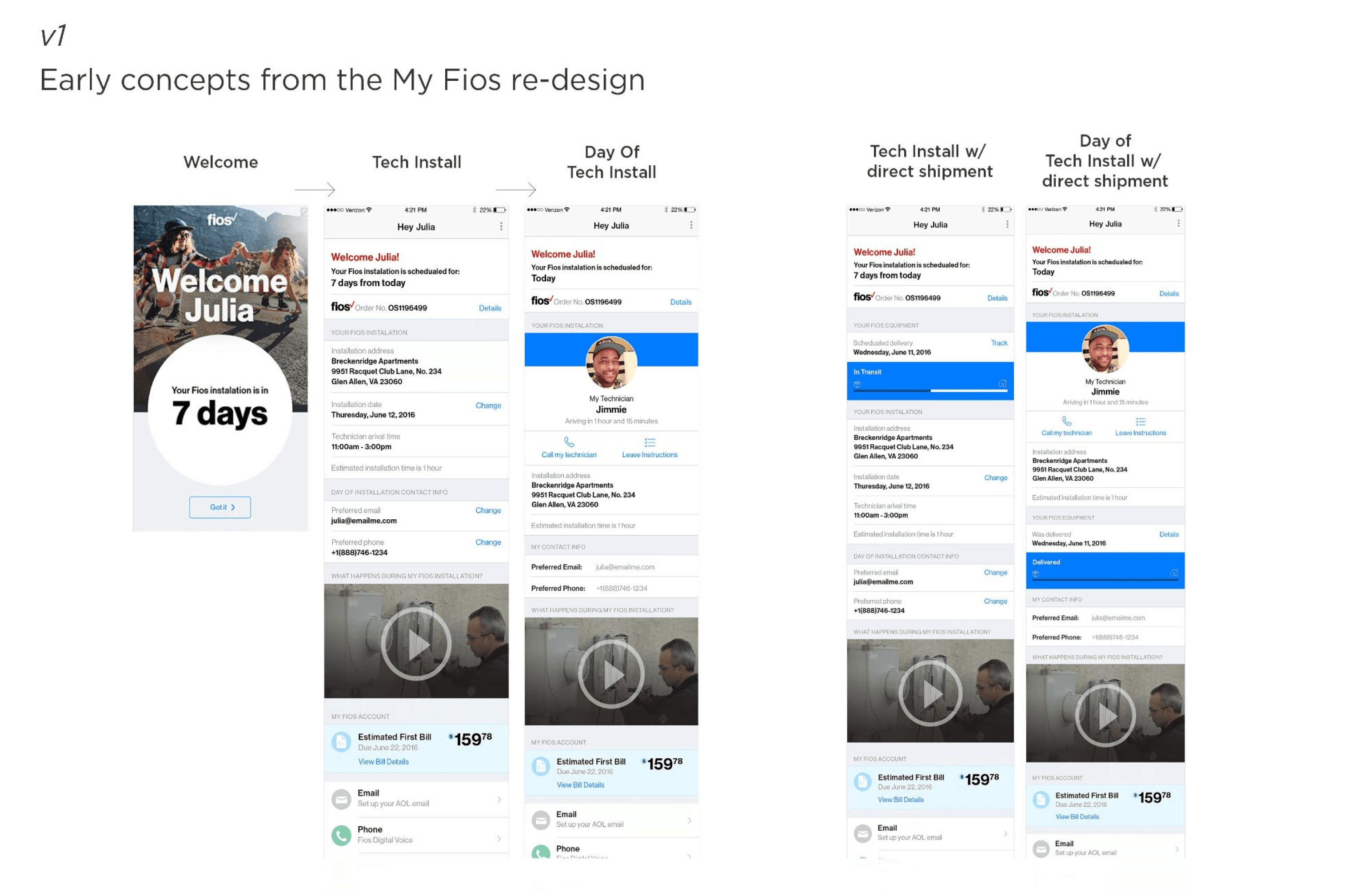
v1
Early Concepts
My Fios App Re-Design
The earliest exploration embedded tech information within the existing My Fios dashboard. The experience was
informational but passive — it told customers what they already knew (their install date and window) without
solving the real anxiety of the day itself. Technician data was absent pending approval, so the designs focused
on setting the right expectations pre-appointment.
Dashboard Integration
Installation Countdown
Arrival Window
Contact Info
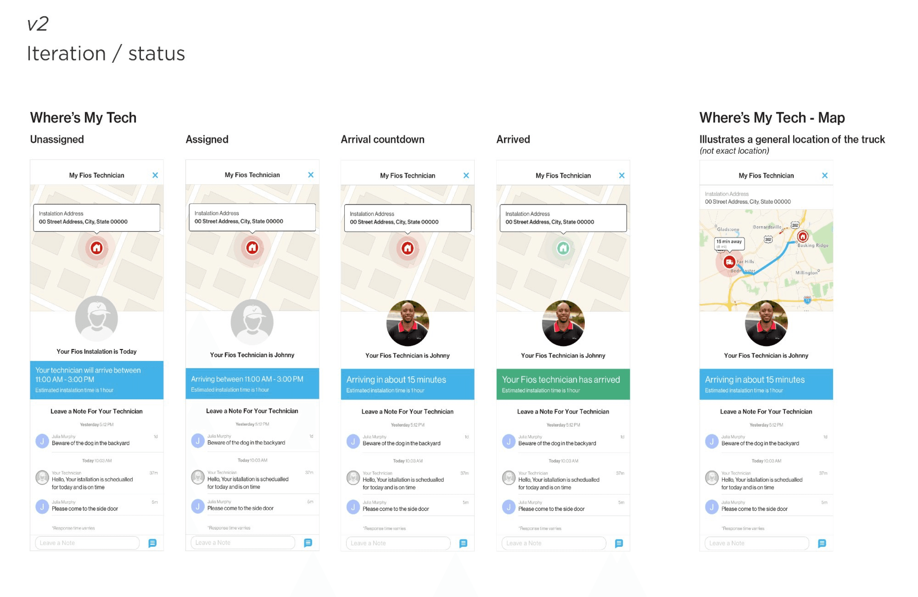
v2
Iteration / Status
Where's My Tech — Status Module
The second iteration introduced a dedicated tracking module with a persistent map view, technician photo, and
a real-time messaging layer that let customers leave notes for their tech. All four tracking states were designed
for the first time as a complete system. The map showed general truck proximity rather than exact location — a
constraint that proved to be the right call.
4 Tracking States
Tech Photo
Live Map
Customer Messaging
General Truck Location
v3
Final Solution
Where's My Tech — Refined & Launched
The final design elevated the experience with a personalized full-screen welcome moment, a cleaner card-based
architecture, and sharper hierarchy across all four states. The Fios brand was woven in more deliberately, and the
status bar's shift to green on arrival became the emotional payoff of the entire flow — a clear, unambiguous
signal that your technician is here.
Welcome Screen
Tech Photo + Name
Real-time ETA
GPS Zone Map
Green Arrival State

Collaboration
Design doesn't ship alone
This project required navigating more stakeholder complexity than most. Here's how
key partnerships shaped the outcome.
Business Team
Partner
Keeping the vision alive through uncertainty
My business partners were the ones navigating the union and legal review
process directly. My role was to keep producing work that made the case for the
feature — designs that were specific enough to demonstrate real value, but
flexible enough to accommodate whatever constraints came back. We ran weekly
alignment sessions throughout the review period so nothing sat still for too long.
Legal & Compliance
Stakeholder
Turning restrictions into design decisions
Rather than treating legal feedback as blockers, I brought design back to legal as
a conversation. When exact GPS was flagged, I mocked up the general location
alternative in the same session and walked through how it addressed their
concern. That approach — show don't tell, even in compliance conversations —
turned potential delays into alignment moments.
Engineering
Partner
Designing for the data we'd actually have
Early on, I sat with the engineering team to understand the real-time data
pipeline — what was feasible, what latency looked like, and what states the system
could reliably detect. That conversation directly shaped the four-state model.
Rather than designing for a perfect data world and hoping engineering could
match it, we co-defined the states based on what the system could actually
know at each moment.
Technicians' Union
Stakeholder
Designing with technicians in mind, not just customers
The union's core concern was that technicians not feel surveilled or held to
impossible real-time standards. Understanding that framing helped me advocate
for the general location model — and to design copy that positioned the tech as
a trusted expert rather than a package being tracked. The feature works better
because of that constraint.
Experience Design
Four states. One seamless journey.
Each state was designed to surface exactly the right information at exactly the right
moment — reducing anxiety progressively as the appointment approached.
Unassigned
A personalized welcome
confirms the appointment
window and sets
expectations. No tech data is
shown yet — but the
experience acknowledges the
day and signals that more
information is coming.
Intentionally calm.
Assigned
A technician has been
assigned. The customer sees
the Fios van, the confirmed
arrival window, and an
estimated installation
duration. The tech's photo
appears here — earlier than
originally planned, based on
pilot feedback showing it
reduced cancellations.
Arrival
Countdown
The technician's name
appears alongside a live
proximity map and real-time
ETA in minutes and miles. The
map shows a general zone
rather than an exact pin —
enough to be useful, without
tracking the technician to the
block.
Arrived
The status bar turns green.
The message is
unambiguous: your
technician is here. Customers
confirmed in testing that this
moment — simple as it is —
was one of the most
reassuring parts of the entire
installation experience.
Business Impact
Results that moved the needle
~18%
Fewer Installation-Day Calls
Inbound support contacts on
installation day dropped significantly
during the pilot. Customers who had
access to Where's My Tech called in
at a meaningfully lower rate than
those who didn't — they had the
information they needed without
picking up the phone.
~22%
Drop in Day-of Cancellations
Day-of cancellations fell substantially
among Where's My Tech users during
the pilot period. Seeing a technician
assigned — with a name and a face —
gave customers a reason to stay
committed to the appointment even
when plans got complicated.
+0.4
CSAT Point Lift
Overall installation satisfaction scores
improved among customers who
used the feature, with the arrival
confirmation state cited most
frequently in positive survey
responses. A small design moment —
a green status bar — turned out to
carry real emotional weight.
My Role on This Project
My Fios App Design Lead
Interaction Design
Visual Design
Stakeholder Partnership
Design Strategy
© Jimmie Solomon · Portfolio Case Study
jimmiesolomon.com