UX Case Study

My Verizon

App Redesign

Unifying Wireless and Fios into one seamless

digital experience for 100+ million customers

Role

Head of Product Design

Timeline

6 Months (2019)

Team

5 Designers

Platform

iOS & Android

UX Case Study

My Verizon

App Redesign

Unifying Wireless and Fios into one seamless

digital experience for 100+ million customers

Role

Head of Product Design

Timeline

6 Months (2019)

Team

5 Designers

Platform

iOS & Android

UX Case Study

My Verizon

App Redesign

Unifying Wireless and Fios into one seamless

digital experience for 100+ million customers

Role

Head of Product Design

Timeline

6 Months (2019)

Team

5 Designers

Platform

iOS & Android

Overview

Unifying Two Worlds in

One Digital Experience

Verizon stood at a pivotal moment. Its two core divisions—Wireless and Wireline (Internet, TV, and home phone)—had long operated as separate ecosystems, each with its own customer experience, design language, and technology stack.

A company-wide reorganization brought these worlds together, creating a mandate for one seamless digital journey. I was brought in to lead the design effort for this unification—arguably the most significant UX transformation in Verizon's digital history.

"The challenge wasn't just visual consistency; it was reimagining how 100+ million

customers would manage their entire Verizon relationship in a single app."

The Challenge

Inherited Complexity &

Organizational Headwinds

Inherited Complexity &

Organizational Headwinds

📱

Fragmented Experience

Two separate apps for Wireless and Fios customers, with no unified

experience for households with both services.

Two separate apps for Wireless and Fios customers, with no unified experience for households with both services.

Two separate apps for Wireless and Fios customers, with no unified experience for households with both services.

73%

of multi-service households didn't know they could manage Fios in

the Wireless app

of multi-service households didn't know they could manage Fios inthe Wireless app

of multi-service households didn't know they could manage Fios inthe Wireless app

🧭

Inconsistent Navigation

Navigation patterns changed depending on which service you were

managing, creating confusion and frustration.

Navigation patterns changed depending on which service you were managing, creating confusion and frustration.

Navigation patterns changed depending on which service you were managing, creating confusion and frustration.

4.2

minutes to complete a bill payment (2× industry benchmark)

minutes to complete a bill payment (2× industry benchmark)

📢

Ad Overload

A cluttered interface overwhelmed with promotional banners, upsells, and

marketing messages that obscured core functionality.

A cluttered interface overwhelmed with promotional banners, upsells, and marketing messages that obscured core functionality.

A cluttered interface overwhelmed with promotional banners, upsells, and marketing messages that obscured core functionality.

34%

of negative reviews mentioned "ad overload"

Poor Ratings

A 2.8-star app store rating, with reviews citing confusion, slow

performance, and difficulty finding basic features.

A 2.8-star app store rating, with reviews citing confusion, slow performance, and difficulty finding basic features.

A 2.8-star app store rating, with reviews citing confusion, slow performance, and difficulty finding basic features.

2.8

app store rating at project start

My Role

Operating at the Intersection of

Strategy, Design & Leadership

Operating at the Intersection of

Strategy, Design & Leadership

1

Design Strategy

Defined the vision and principles

that guided all design decisions.

Created the experience strategy

deck that aligned executives on

our north star.

Defined the vision and principles that guided all design decisions.

Created the experience strategy deck that aligned executives on

our north star.

Defined the vision and principles that guided all design decisions.

Created the experience strategy deck that aligned executives on

our north star.

2

Stakeholder Management

Navigated competing priorities

between Wireless and Wireline

leadership. Facilitated workshops

to build consensus and created

shared success metrics.

Navigated competing priorities between Wireless and Wireline leadership. Facilitated workshops to build consensus and created shared success metrics.

Navigated competing priorities between Wireless and Wireline leadership. Facilitated workshops to build consensus and created shared success metrics.

3

Hands-On Design

Led the design of the unified home

screen and navigation system.

Created the initial prototypes that

sold the vision internally.

Led the design of the unified home screen and navigation system.

Created the initial prototypes that

sold the vision internally.

Led the design of the unified home screen and navigation system.

Created the initial prototypes that

sold the vision internally.

4

Team Leadership

Directed a team of 5 designers

across interaction design, visual

design, and prototyping.

Established critique rhythms and

quality standards.

Directed a team of 5 designers across interaction design, visual design, and prototyping. Established critique rhythms and quality standards.

Directed a team of 5 designers across interaction design, visual design, and prototyping. Established critique rhythms and quality standards.

Research & Discovery

Understanding Our Users

Understanding Our Users

We began with an extensive research phase, combining quantitative data analysis with

qualitative user research.

We began with an extensive research phase, combining quantitative data analysis with qualitative user research.

We began with an extensive research phase, combining quantitative data analysis with qualitative user research.

32

32

32

User Interviews

User Interviews

User Interviews

18mo

18mo

18mo

Support Call Data

Support Call Data

Support Call Data

2.4K+

2.4K+

2.4K+

App Reviews Analyzed

App Reviews Analyzed

App Reviews Analyzed

12

12

12

Competitive Apps

Competitive Apps

Competitive Apps

86%

86%

of app sessions were for just 3 tasks

of app sessions were for just 3 tasks

of app sessions were for just 3 tasks

Check bill

Make payment

View data

86

"

I'm sure that stuff is useful, but right now I just need to pay my bill before it's late. Where do I do that?

I'm sure that stuff is useful, but right now I just need to pay my bill before it's late. Where do I do that?

— Research Participant

73%

73

of multi-service households didn't know they could manage Fios in the Wireless app

of multi-service households didn't know they could manage Fios in the Wireless app

of multi-service households didn't know they could manage Fios in the Wireless app

#1

"Ad overload"

"Ad overload"

was the #1 complaint in app store reviews

was the #1 complaint in app store reviews

was the #1 complaint in app store reviews

34% of negative reviews

PERSONNA DEVELOPMENT

Core Personas Guiding Our Decisions

Core Personas Guiding Our Decisions

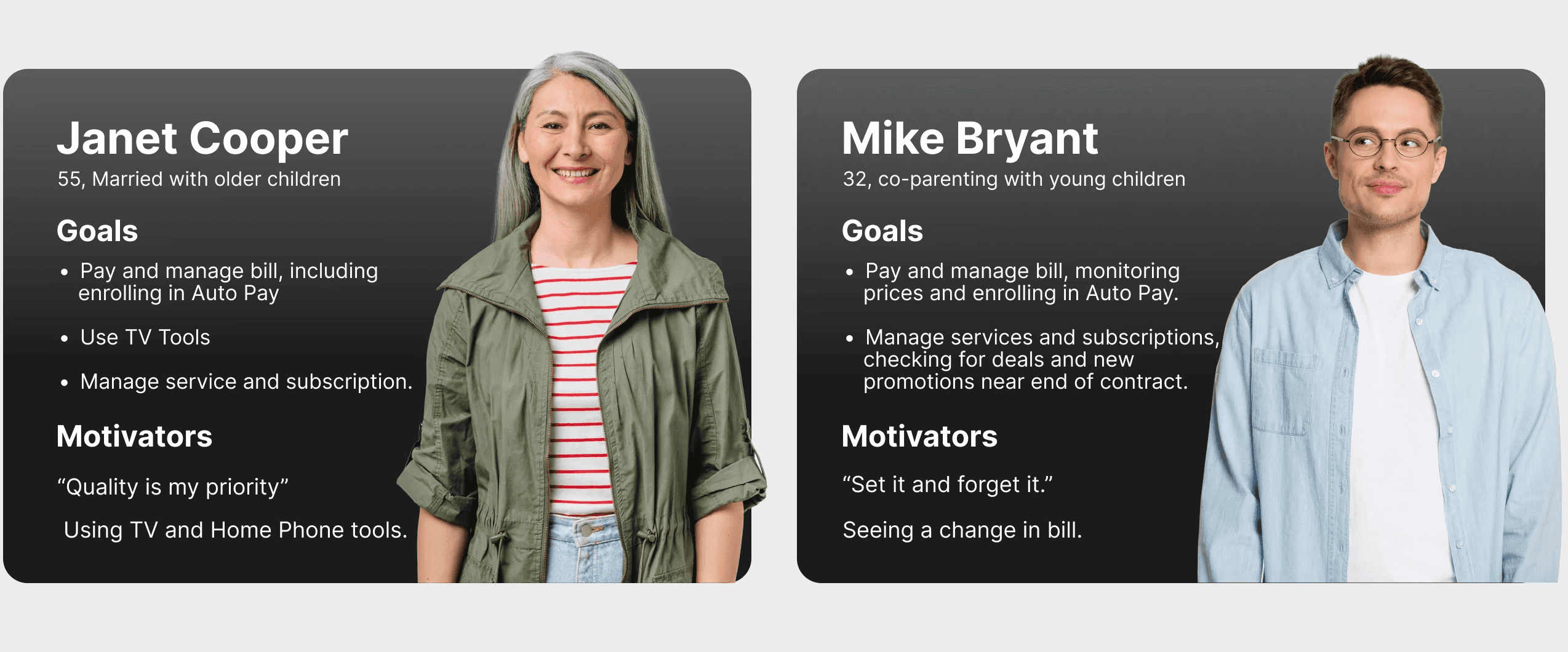
Defining the Problem

Design Principles That

Became Our Decision-Making

Framework

Design Principles That

Became Our Decision-Making Framework

To operationalize our vision, I established four design principles that

guided every decision throughout the project.

To operationalize our vision, I established four design principles that guided every decision throughout the project.

Problem Statement

How might we create a single, intuitive app experience that lets

customers effortlessly manage all their Verizon services—while

respecting their time and attention?

How might we create a single, intuitive app experience that lets

customers effortlessly manage all their Verizon services—while

respecting their time and attention?

Principle 01

01

Tasks First, Promotions Second

The home screen should surface what users came to do, not what we want

to sell them. Promotional content earns its place through relevance and

restraint.

The home screen should surface what users came to do, not what we want to sell them. Promotional content earns its place through relevance and restraint.

The home screen should surface what users came to do, not what we want to sell them. Promotional content earns its place through relevance and restraint.

Principle 03

03

Progressive Disclosure

Surface the 20% of features that serve 80% of needs. Advanced

functionality should be accessible but not in the way.

Surface the 20% of features that serve 80% of needs. Advanced functionality should be accessible but not in the way.

Surface the 20% of features that serve 80% of needs. Advanced functionality should be accessible but not in the way.

Principle 02

02

One Account, One Experience

Whether you have Wireless, Fios, or both—the app should feel like one

coherent product, not two apps stitched together.

Whether you have Wireless, Fios, or both—the app should feel like one coherent product, not two apps stitched together.

Whether you have Wireless, Fios, or both—the app should feel like one coherent product, not two apps stitched together.

Principle 04

04

Clarity Over Cleverness

Use plain language. Show real numbers. Make the billing crystal clear. Trust

erodes when customers feel confused.

Use plain language. Show real numbers. Make the billing crystal clear. Trust erodes when customers feel confused.

Use plain language. Show real numbers. Make the billing crystal clear. Trust erodes when customers feel confused.

The Design Process

6-Month Journey to Launch

6-Month Journey

to Launch

A research-driven process that prioritized user needs while navigating complex organizational dynamics.

Weeks 1-4

Research & Discovery

Research & Discovery

32 user interviews

32 user interviews

Support call analysis

Support call analysis

App store review coding

App store review coding

Competitive analysis

Competitive analysis

Key Insight

86% of sessions were for just 3 tasks

86% of sessions were for just 3 tasks

Weeks 5-8

Divergent Exploration

Divergent Exploration

2-day design sprint

2-day design sprint

2-day design sprint

6 concept directions

6 concept directions

6 concept directions

Clickable prototypes

Clickable prototypes

Clickable prototypes

User testing (12 users)

User testing (12 users)

User testing (12 users)

Key Insight

Users wanted efficiency, not engagement

Users wanted efficiency,

not engagement

Weeks 9-16

Focused Iteration

Focused Iteration

Task-first home screen

Task-first home screen

Task-first home screen

Unified navigation

Unified navigation

Unified navigation

New visual language

New visual language

New visual language

4 rounds of testing

4 rounds of testing

4 rounds of testing

Key Insight

Key Insight

Less intrusive promos improved

conversion 23%

Less intrusive promos improved

conversion 23%

Weeks 17-24

Launch & Validation

Launch & Validation

6-week phased rollout

6-week phased rollout

6-week phased rollout

A/B testing

A/B testing

Performance monitoring

Performance monitoring

Performance monitoring

Rapid iteration

Rapid iteration

Key Insight

Key Insight

Reached 4.6★ within 90 days

Reached 4.6★ within 90 days

Early Exploration

Low-Fidelity Prototypes

Low-Fidelity Prototypes

We created early wireframes to test the unified navigation model and task-first hierarchy with users before investing in visual design.
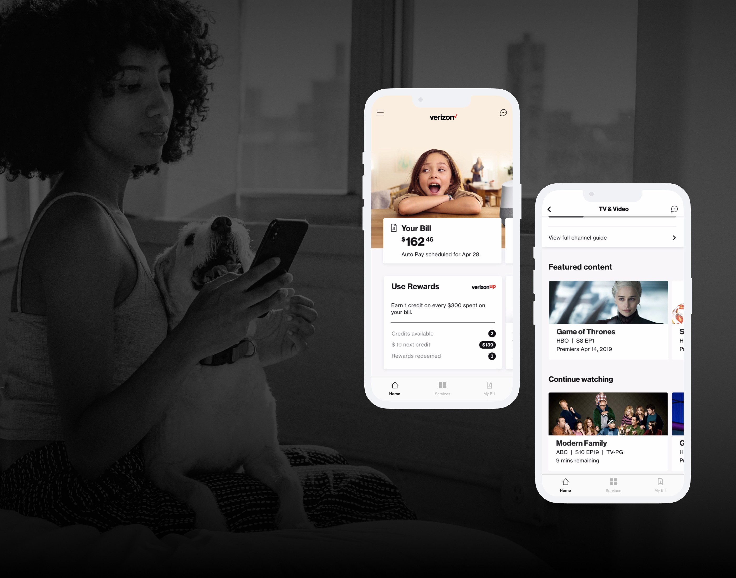
The Solution

Final Designs

Final Designs

A unified, task-first experience that lets customers manage all their

Verizon services in one place.

Two Accounts. One Login.

A personalized view of all things Verizon—Mobile, 5G, and Fios in one place.

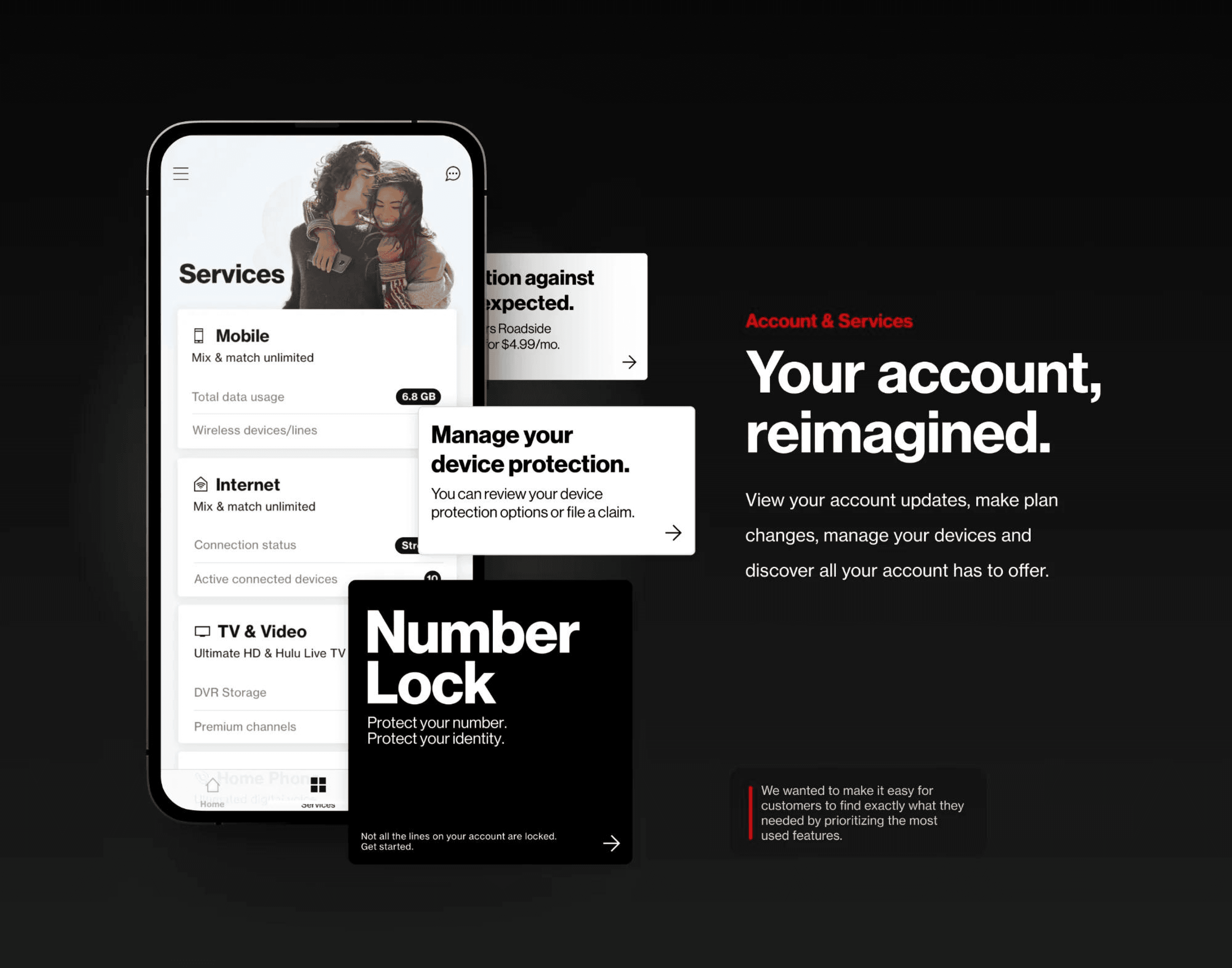
Your Account, Reimagined

View your account updates, make plan changes, manage your devices and discover all your account has to offer.

Your Bill, Simplified

Easy to understand. Easy to pay. Designed to manage both Fios and Wireless billing from a single app.

Results & Impact

Measurable Improvements Across

Every Metric

Measurable Improvements Across Every Metric

Measurable Improvements Across Every Metric

The redesigned app launched to all users over a 6-week rollout. The

results validated our research-driven approach.

The redesigned app launched to all users over a 6-week rollout. The results validated our research-driven approach.

The redesigned app launched to all users over a 6-week rollout. The results validated our research-driven approach.

4.6

App Store Rating

App Store Rating

App Store Rating

Up from 2.8 stars

Up from 2.8 stars

Up from 2.8 stars

52

%

Faster Bill Pay

Faster Bill Pay

Faster Bill Pay

1.8 min vs 4.2 min

1.8 min vs 4.2 min

1.8 min vs 4.2 min

31

%

Fewer Support Calls

Fewer Support Calls

Billing confusion reduced

Billing confusion reduced

Billing confusion reduced

2.3

M

More Monthly Users

More Monthly Users

8.1M → 10.4M MAU

8.1M → 10.4M MAU

8.1M → 10.4M MAU

+47%

Multi-service adoption

+18 pts

NPS increase

90 days

Time to 4.6★ rating